Prepress –
We Make Your Files
Ready for Print
We prepare and review print files to ensure technical accuracy and production consistency. From bleed and trim setup to color management and trapping, every detail is checked according to professional printing standards.
Services
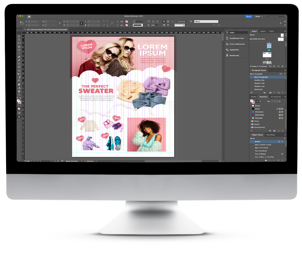
Preflight
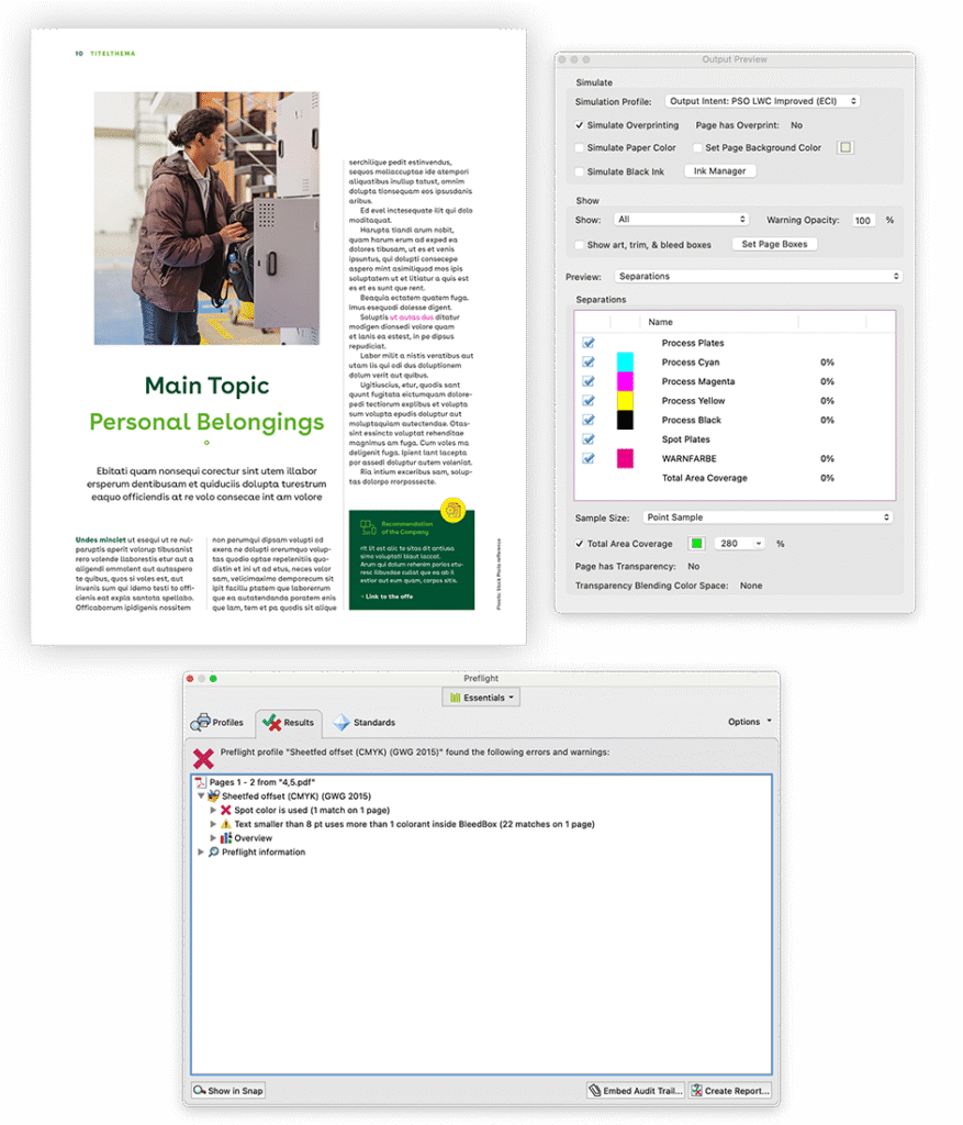
Preflight is the process of checking a print file before it goes into production — similar to a final inspection before takeoff.
During preflight, the file is automatically and manually checked for technical issues that could cause problems in printing, such as:
- Missing fonts or images
- Incorrect color modes (RGB instead of CMYK)
- Missing bleeds or trim marks
- Low-resolution images
- Wrong page sizes or spot colors
Preflight ensures that everything in your file meets printing standards and your printer’s specific requirements.
By catching and correcting these issues early, we prevent costly delays, reprints and color inconsistencies — saving you time and guaranteeing a smooth production process.
Page size and bleed inspection
We verify that each page is set to the correct final size and that a proper bleed (usually 3 mm) is included. The bleed extends images or backgrounds beyond the trim edge, so when the sheet is cut, there are no visible white borders.
Trim Size: The trim size (shown by the dotted blue line) indicates the exact final dimensions of the printed page after cutting. It defines where the page will be trimmed to achieve its finished size.
Cut Marks: Cut marks (or crop marks) show where the printed sheet should be trimmed to match the final page size. They serve as guides for the cutting machine to ensure accuracy and alignment.
Color Bars: Color bars are control strips printed outside the page area. They help printers monitor ink density, color consistency and registration during the print run, ensuring stable and predictable color reproduction.
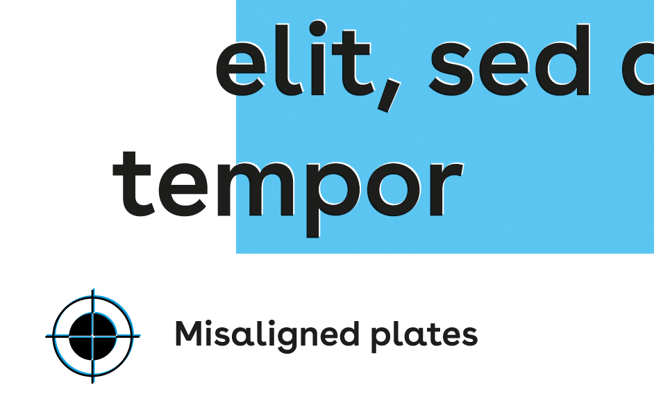
Registration Marks: Registration marks are small crosshairs that help align the separate color plates (cyan, magenta, yellow and black). Proper registration ensures that all colors print in perfect alignment, keeping images and text sharp and clear.
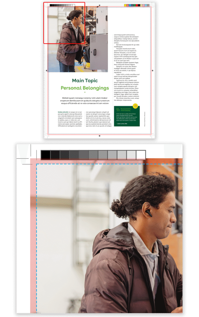
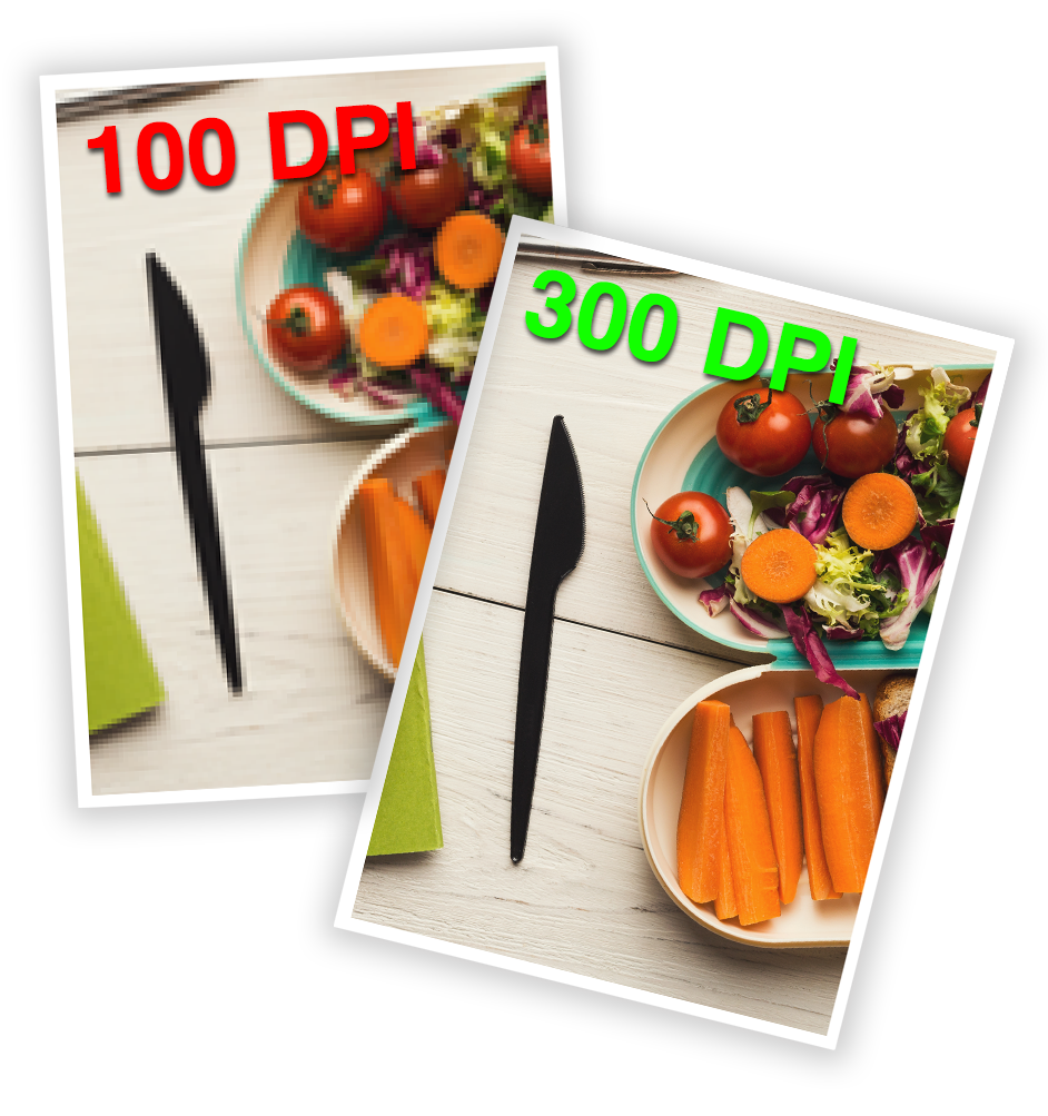
Image resolution
Image resolution determines how sharp and detailed an image will appear in print. It’s measured in dots per inch (DPI) — the higher the resolution, the clearer the printed image. For professional printing, images should be at least 300 DPI at their final size. Low-resolution images may look fine on screen but will appear blurry or pixelated in print, reducing overall quality and professionalism.
Our Role: We ensure all images meet print-resolution standards, adjusting or recommending changes so graphics remain sharp, clear and high-quality in the final printed material.
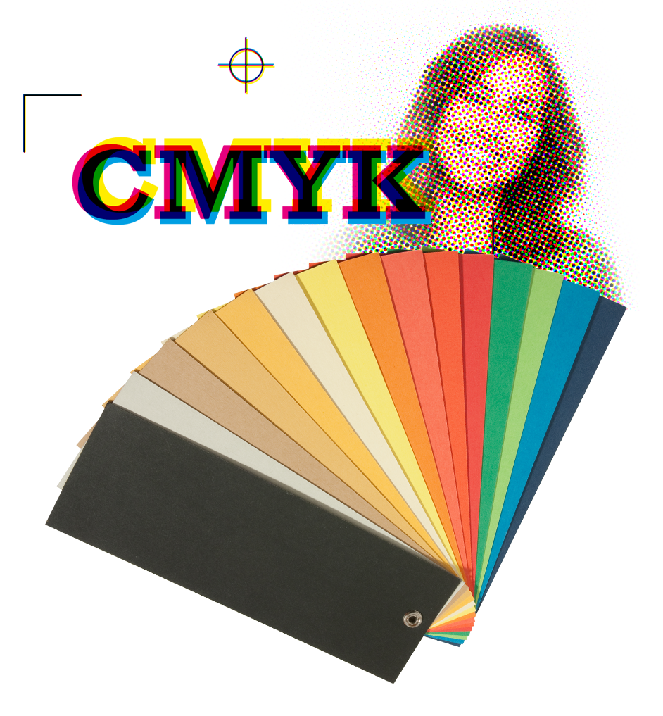
CMYK and Spot colors
CMYK Colors
CMYK stands for Cyan, Magenta, Yellow and Black — the four inks used in standard full-color printing. By combining these inks in varying amounts, printers can reproduce a wide range of colors. Most magazines, brochures and packaging are printed in CMYK. It’s ideal for photos and designs with many color tones, but not always for exact brand color matching.
Spot Colors
Spot colors use pre-mixed inks (like Pantone colors) instead of mixing CMYK during printing. They ensure precise, consistent color — perfect for logos, brand elements, or when metallic or fluorescent inks are needed. Spot colors are often used when color accuracy or special effects are essential.
RGB Colors
RGB stands for Red, Green and Blue, the colors used for screens and digital displays. These colors create light, not ink. Because printing uses ink on paper (CMYK), RGB colors can’t be reproduced accurately in print — they often appear duller or shifted when converted. That’s why all images for printing must be converted from RGB to CMYK to ensure predictable color results.
Our Role: We prepare files for accurate CMYK and spot color printing, ensuring colors are consistent and correctly defined.
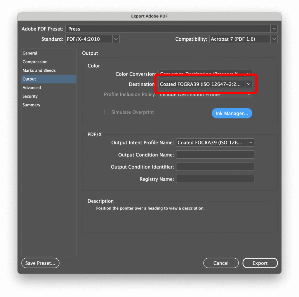
Color Profiles
Color profiles define how colors are interpreted and reproduced across different devices—monitors, scanners, cameras, and printers. Since each device displays color differently, profiles ensure consistent and predictable results from screen to print. In printing, ICC color profiles (such as ISO Coated v2, FOGRA39, or US Web Coated SWOP) describe how inks behave on specific types of paper and printing presses. Using the correct profile is essential for maintaining accurate color balance, contrast and saturation throughout the production process.
Our Role: We check and assign the correct ICC color profiles for every file, ensuring that on-screen colors are accurately translated into print. We also convert files to the required CMYK profile, verify embedded profiles and prepare color-managed PDFs optimized for the chosen print standard. This guarantees consistent, reliable color results across all printed materials.
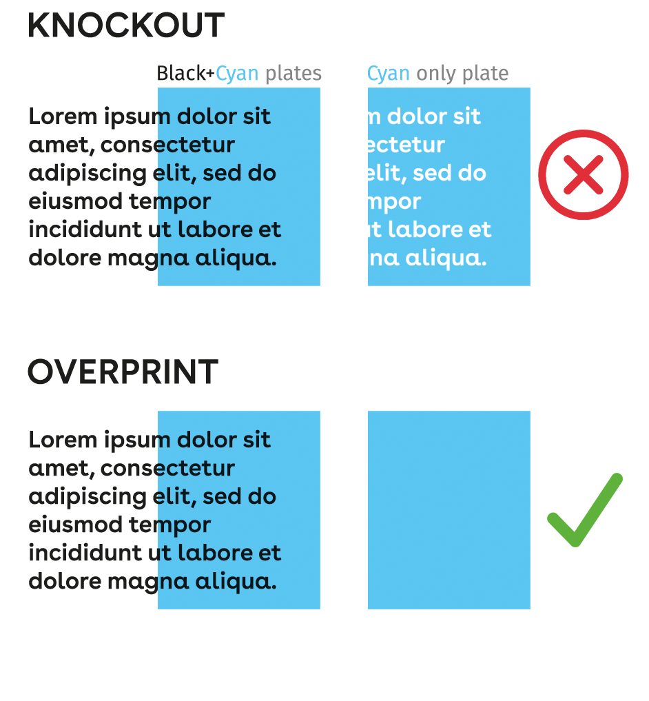
Black Color Handling and Overprinting
Black is a critical color in printing, especially for text, lines and graphic elements. If black objects are not prepared correctly, they can appear dull, misaligned, or uneven on the final print. This is particularly important when black overlaps other colors.
Overprinting ensures that black elements are printed on top of other inks without knocking out the underlying colors, preventing gaps, registration issues, or unwanted color shifts. Rich black, created by combining black with small amounts of other CMYK inks, can also enhance depth and density for large black areas.
Our Role: We carefully check and prepare all black text and graphics for proper overprinting or rich black settings. By doing so, we ensure sharp, consistent and high-quality results, avoiding misprints, color inconsistencies, or registration problems. Our prepress expertise guarantees that black elements always appear as intended in the final printed product.
Transparency
Transparency effects — such as drop shadows, glows, or semi-transparent images — can cause issues when printed if not handled correctly. What looks fine on screen can print with unwanted boxes, color shifts, or jagged edges, especially when combined with spot colors or different blending modes.
Our role is to check and properly flatten transparencies to ensure they reproduce exactly as intended. We make sure all effects are compatible with the printing process and output format (usually PDF/X standards), so your designs print smoothly — without visual artifacts or production errors.
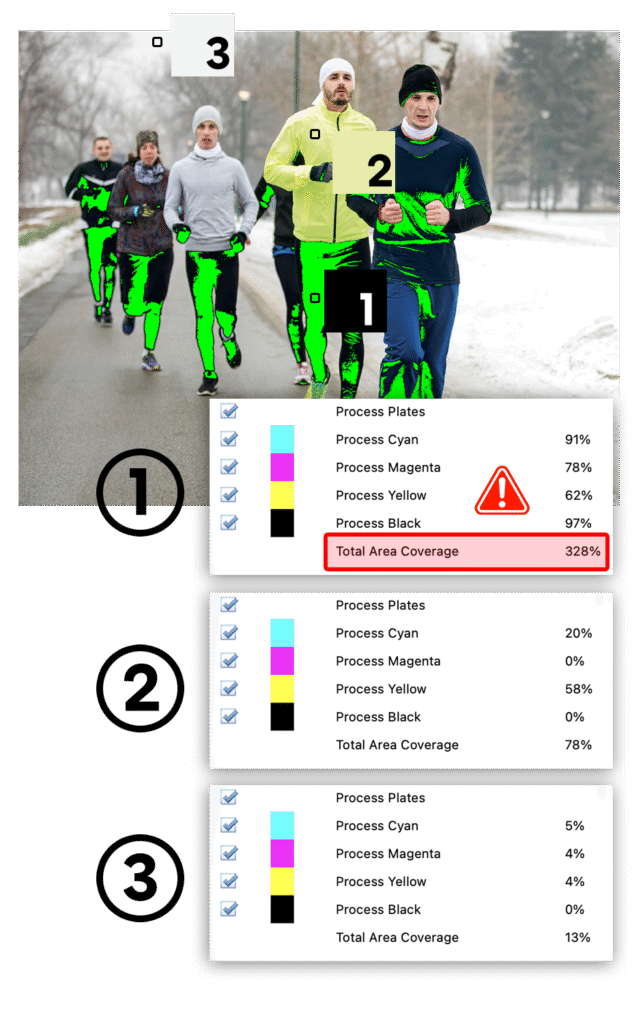
Ink Coverage
Ink coverage refers to the total amount of ink used in a printed area — the combined percentages of Cyan, Magenta, Yellow and Black (CMYK). For example, a rich black might use 30% Cyan, 30% Magenta, 30% Yellow and 100% Black, resulting in a total ink coverage of 190%.
Every printing process and paper type can handle only a certain maximum amount of ink — usually between 260% and 320% for coated paper and less for uncoated paper. Exceeding this limit can cause problems such as ink smudging, drying issues, or paper curling.
Our role is to check every file for proper ink limits. We adjust images and colors when necessary to make sure the total ink coverage stays within the printer’s specifications — ensuring that your prints dry correctly, look clean and maintain consistent color quality.
Trapping
Trapping is a technique used in printing to compensate for small misalignments that can occur between color plates during the printing process. When two colors meet edge-to-edge, even the slightest shift can create visible white gaps or unwanted overlaps. Trapping prevents this by slightly expanding or overlapping adjacent colors, ensuring clean and seamless transitions between them on press.
Our role:
We inspect files and apply precise trapping where needed — typically a few tenths of a millimeter — according to the printing method and substrate. Offset, flexo and digital presses each have different tolerances and we adjust accordingly.

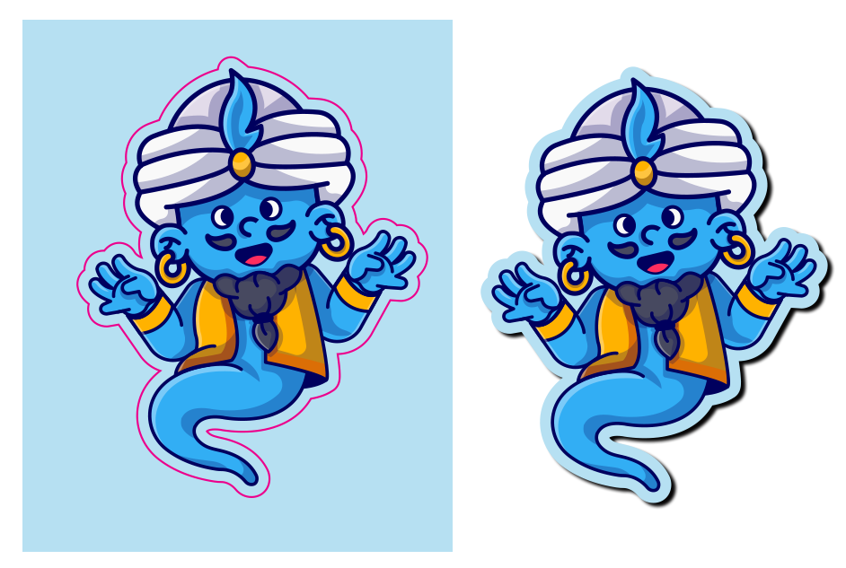
Cut countours and Die Cut
Cut contours and die cuts define the exact shape your printed piece will be cut into. While most prints are rectangular, many products — such as stickers, packaging, or promotional materials — require custom shapes. These shapes are created using a cut path (often a special spot color named “CutContour”) that tells the cutting machine exactly where to trim.
A die cut is a similar concept used in production — it’s a physical cutting tool or digital outline that determines where the printed sheet will be cut, folded, or perforated. Precise setup of these lines is crucial, as any misalignment can cause visible white edges or uneven cuts.
Our role is to create and verify accurate cut contours for your designs. We make sure the cutting paths are in the correct layer, named properly and won’t interfere with printed artwork. This ensures that your packaging, labels, or shaped prints are cut cleanly, align perfectly and match the design exactly as intended.
Layout Adjustments and Corrections
A well-prepared layout is essential for a clean, professional print result. Layout adjustments involve checking that all elements — text, images, margins and alignment — are correctly positioned and visually balanced. Even small inconsistencies, like misaligned boxes, missing bleeds, or uneven spacing, can become very noticeable once printed.
Sometimes files arrive with layout issues caused by incorrect document setup, last-minute edits, or software conversions. These can include shifted text, missing links, wrong page sizes, or overlapping objects that won’t print as expected.
Our role is to carefully inspect your files and make precise layout corrections before they go to print. We ensure everything follows printing standards — from proper margins and consistent spacing to correct alignment and safe zones for cutting.
White Ink
Printing on transparent, metallic, or colored materials often requires more than standard CMYK setup.
White ink and other special printing layers (such as metallic, varnish or foil) must be precisely prepared to ensure accurate color reproduction and visual impact.
White ink is especially important when printing on clear films, transparent labels, or metallic substrates. In these cases, it serves as a white back print — a solid base printed behind CMYK colors to make them appear bright and opaque. Without this layer, colors can look washed out or semi-transparent because the background material shows through. For example, a logo printed directly on a clear sticker without white ink would appear dull when applied to a dark surface.
Depending on the project, white ink can also be used selectively — for instance, to keep some areas transparent while making others fully opaque. This requires carefully defined vector masks or pixel-based channels to control where the white ink is applied.
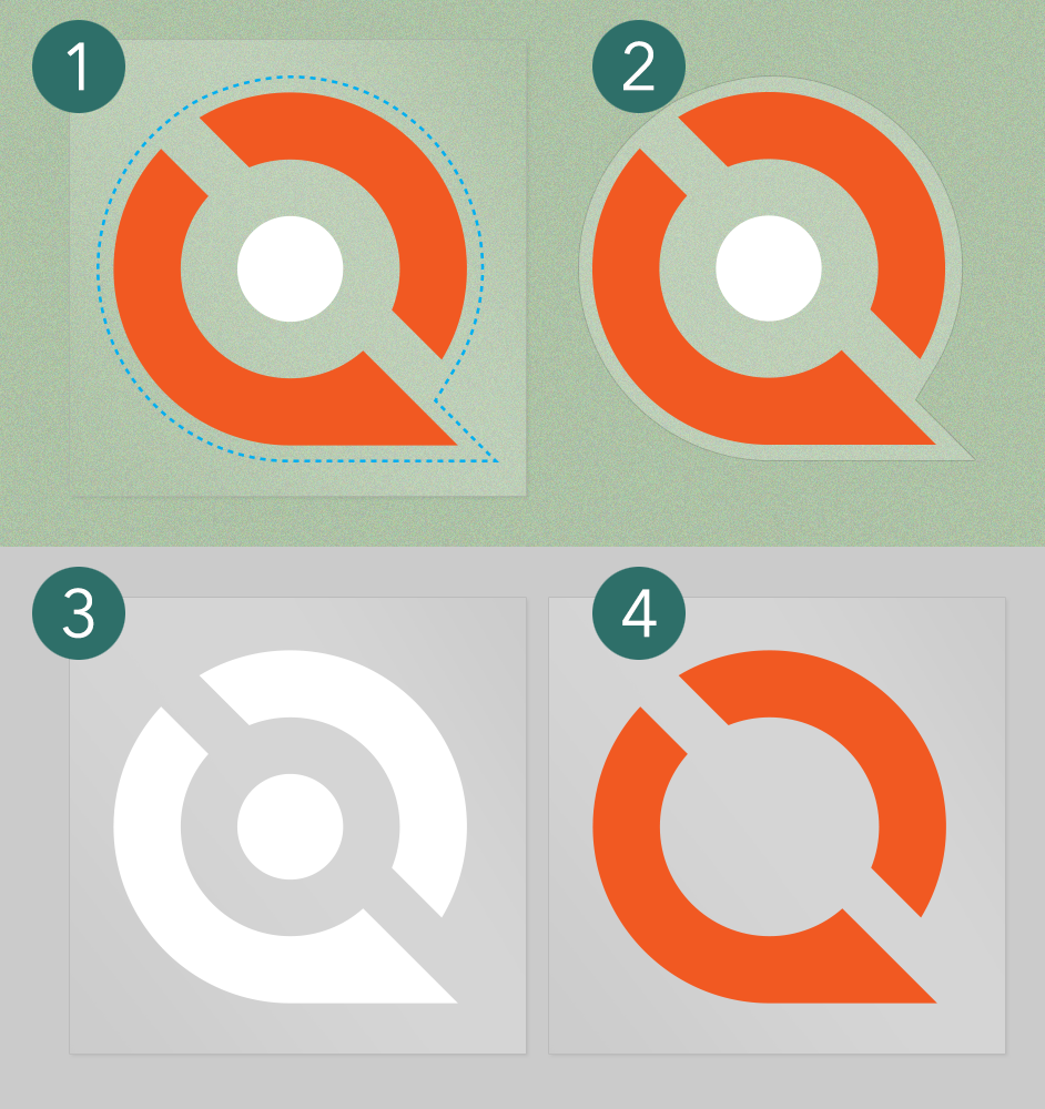
1) Printed sticker on transparent foil
2) Final product with cut sticker shape
3) White underlay
4) Color (CMYK or Spot) print
The logo has white circle in the middle, as intended. White undelay is also necessary in the colord part of the logo to ensure the colors appear vibrant, opaque and true to color.
Our role is to create and organize all these technical layers properly. We define white ink coverage for the correct level of opacity, build vector paths for special effects and ensure layer names and overprint settings meet the printer’s specifications.
Foil Stamp and Special Colors
Foil stamping and special colors add visual and tactile distinction to printed materials. Metallic foils, pantone inks and other custom color effects are printed separately from standard CMYK and require precise file preparation to ensure accurate alignment and finish.
We prepare the necessary layers for these special printing effects — including vector-based foil areas, spot color channels and overprint settings — so the printer can apply them flawlessly. Whether it’s a metallic gold logo, raised varnish highlight, or a specific brand color that cannot be reproduced in CMYK, we make sure the file communicates these effects clearly to production.
Our role:
We create and define special color layers (such as Foil, Varnish, Emboss, or Pantone) with proper naming, overprint settings and registration accuracy. We also verify that these layers meet the printer’s technical specifications, avoiding production errors like color shifts, misalignment, or unwanted transparency blending.
The result is a print-ready file where every special color or foil element is perfectly prepared — ensuring your premium finishes look exactly as intended once they reach the press.
Request a free file audit.
Please attach a file you would like to have reviewed or describe your project.
+381 61 660-2538
Get in touch about your project
Maximum 4 files, up to 15 MB total.